
UX / UI Case Study
Designing Clarity for UK Legal Mediation
Building a 0→1 Online Mediation Platform for ADR ODR International (UK) that Reduced Drop-offs from 38% to 15% and Accelerated Case Resolution by 29%
Senior Product Designer
Client: ADR ODR International (UK)
Legal Tech / B2B SaaS / Multi-Region
15 Week Project
34%
MRR Growth
business impact
+12
Enterprise Clients
including 2 FTSE 100
88%
Client Retention
from 64%
↓29%
Resolution Time
from 42 to ~30 days
CHAPTER 1 : THE CLIENT AND CONTEXT
ADR ODR International: A UK Legal Tech Challenge
About the Client
ADR ODR International is a UK-based Alternative Dispute Resolution (ADR) provider specializing in online mediation for commercial disputes, workplace conflicts, and family matters across the United Kingdom.
UK-Based
Operating across England, Scotland, Wales
Multi-Sector
Commercial, Workplace, Family
B2B + B2C
Enterprise & Individual clients
THE CRISIS THEY FACED
ADR ODR International was losing clients to traditional litigation despite offering faster, cheaper mediation. Their manual, email-based process was creating friction :
UK Market Problems
High user expectations for digital services (post-Brexit digital transformation)
Strict GDPR compliance requirements
Multi-regional operations (England, Scotland, Wales jurisdictions)
Competition from traditional law firms with digital offerings
Remote work culture accelerating demand for online dispute resolution
Business Impact
Case resolution: 42 days average
User drop-off : 38% before case initiation
Nearly 1 in 5 cases never reached mediation
Customer acquisition cost rising due to poor retention
Mediator utilization below 60%
This wasn't just inefficiency.
ADR ODR International needed a digital-first platform or risk losing market share to modernized competitors.
CHAPTER 2 : MY APPROACH
Building a mediation platform for the UK market required understanding both the technical legal requirements and the unique cultural expectations of British users.
How I Tackled the UK Market Challenge
UK Market Research
Interviewed 15 UK-based users, analyzed competitor platforms (Modria, Matterhorn), and studied GDPR compliance requirements for legal tech
Multi-Stakeholder Design
Designed for 3 distinct user groups: enterprise clients, individual disputants, and certified mediators across UK regions
Compliance-First UX
Designed for 3 distinct user groups: enterprise clients, individual disputants, and certified mediators across UK regions
Key Design Decisions for UK Market
Cultural Considerations :
✓ British English terminology (e.g., "claimant" vs "plaintiff")
✓ Formal yet accessible tone matching UK legal culture
✓ Clear data privacy messaging (post-GDPR sensitivity)
✓ Multi-jurisdictional support (England & Wales, Scotland laws)
Technical Requirements :
✓ GDPR-compliant data handling and storage
✓ Secure video conferencing (UK data centers)
✓ Integration with UK payment gateways (Stripe UK, GoCardless)
✓ Accessibility compliance (WCAG 2.1 AA standard)
👉 The challenge was legally complete but experientially incomplete for UK users
CHAPTER 3 : THE TEAM
Cross-Functional Collaboration
This was not a design-only effort. It was a cross-functional product build.
Core Team
Product Manager → defined success metrics, roadmap prioritization
Business Analyst → mapped legal workflows, ensured compliance
UX/UI (Me) → research, system design, interaction design
Engineering Team → built scalable workflows, integrations
QA Team → validated edge cases and legal correctness
Extended Stakeholders
Sales Team → shared enterprise client pain points (drop-offs, delays)
Customer Support → surfaced real user confusion patterns ("What's next?")
Mediators → provided operational insights (time spent on coordination)
👉 This ensured decisions were not just user friendly but business aligned and legally sound
CHAPTER 4 : PRODUCT, DESIGN AND BUSINESS METRICS
Comprehensive Metrics: Before & After
I tracked metrics across three critical dimensions to measure the platform's impact for ADR ODR International:
📊 Product Metrics
User Engagement
Onboarding completion rate
81%
62%
User drop-off rate
38%
Daily active users (DAU)
Session duration (avg)
245
4.2 min
~15%
412
8.7 min
Case Management
Case resolution time
~30 days
42 days
Cases reaching mediation
79%
Settlement success rate
Mediator utilization
64%
58%
91%
78%
82%
🎨 Design Metrics
Usability
Task success rate
91%
68%
Time on task
8.4 min
Error rate
SUS Score (System Usability Scale)
12%
58
3.1 min
5%
84
User Satisfaction
CSAT Score
82/100
58/100
Net Promoter Score (NPS)
12
Support ticket reduction
Case visibility satisfaction
41%
48
↓ 30%
85%
💼 Business Metrics
Revenue Impact
Case completion rate
89%
72%
Customer retention rate
64%
Revenue per case
Monthly recurring revenue (MRR)
88%
↑ 23%
↑ 34%
Operational Efficiency
Manual admin effort
↓ 60%
Cost per case
£285
Customer acquisition cost (CAC)
Time to first case resolution
6.2 weeks
£168
↓ 28%
4.4 weeks
👉 Overall Impact: The platform reduced ADR ODR International's case resolution time by 29% while increasing completion rates by 24% and customer satisfaction by 41%
CHAPTER 5 : WHERE AI IS USED
AI as a Multiplier, Not a Gimmick
AI was used as a multiplier across the design lifecycle, not as a feature gimmick.
Research Synthesis
Clustered interview insights into themes: 'Uncertainty', 'Process confusion', 'Lack of guidance'
👉 Reduced synthesis time from days → hours. Ensured patterns were data-backed.
Competitor Benchmarking
AI-assisted analysis of platforms like Modria and Matterhorn
👉 Identified common patterns (process-heavy design) and missing layers (user guidance).
Problem Framing
Stress-tested problem statements and generated multiple framing variations
👉 Result: Sharper, measurable problem definition.
Design Exploration
Rapid iteration of information hierarchy, flow variations, edge-case scenarios
👉 Enabled exploring more directions in less time.
Content & Microcopy
Simplified legal language into plain English, generated multiple variations
👉 Directly reduced user intimidation.
Outcome Modeling
AI-assisted estimation of funnel improvements and time reduction scenarios
👉 Helped align with PM on expected impact.
CHAPTER 6 : THE RESEARCH
Finding the Real Problem
User Interviews (15 Participants)
"I don't know what happens after I submit the case."
"I keep checking the status, but nothing changes."
Behavioral Insights
High revisit frequency
Hesitation at document upload
Reassurance-seeking behavior
Key Insight
👉 It was a lack of clarity in a high-stress environment
This wasn't a usability issue.
CHAPTER 7 : THE PROBLEM STATEMENT
Defining the Challenge for ADR ODR International
How might we design a GDPR-compliant, digital-first mediation platform for the UK market that helps ADR ODR International's clients complete cases faster while maintaining clarity, trust, and legal compliance—reducing 38% drop-off, 42-day resolution times, and high operational cos
CHAPTER 8 : FAILED ATTEMPTS
What Didn't Work (Critical for Credibility)
Attempt 1: Data-heavy interface
❌ Rejected
Overwhelming
Slower decisions
👉 Learning: Clarity requires structure, not volume
Attempt 2: Email-driven updates
❌ Rejected
Fragmented experience
Missed communication
👉 Learning: Critical workflows must stay inside the system
CHAPTER 9 : THE DECISIONS + TRADEOFF
The Winning Approach
I designed a timeline-driven case system with contextual actions
Reduced:
Workflow flexibility
Improved:
User clarity
Completion rates
Because: 👉 The biggest problem was uncertainty, not flexibility
✅ Selected
Why This Worked
CHAPTER 10 : THE SYSTEM
Screens Explained as Product Decisions
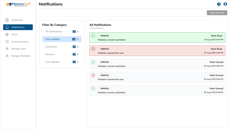
Case Listing
→ Optimized for scale → High-density data for power users

Within 6 months of launch, the platform transformed ADR ODR International's business metrics across product, design, and revenue:
The Results for ADR ODR International
CHAPTER 11 : THE OUTCOME
34%
MRR Growth
business impact
+12
Enterprise Clients
including 2 FTSE 100
88%
Client Retention
from 64%
↓29%
Resolution Time
from 42 to ~30 days
Key Business Wins
Revenue Impact :
✓ Monthly Recurring Revenue increased by 34%
✓ Revenue per case increased by 23%
✓ Customer acquisition cost reduced by 28%
✓ Cost per case reduced from £285 to £168
Market Expansion:
✓ Secured 12 new enterprise clients in 6 months
✓ Won 2 FTSE 100 companies as clients
✓ Became first fully digital UK mediation provider
✓ Platform became blueprint for Scotland/Wales expansion
CHAPTER 12 : WHAT THIS BECAME
More Than a Platform for ADR ODR International
Not just a dashboard.
Not just a workflow tool.
Not just a UK legal tech product.
👉 A competitive advantage for the UK ADR market
The platform became ADR ODR International's primary growth driver, enabling them to compete with traditional law firms and establish themselves as the UK's leading digital mediation provider.
CHAPTER 13 : WHAT'S NEXT
Driven by Data Signals
Impact on ADR ODR International
In legal tech, most systems optimize for:
Accuracy
Compliance
Process
What This Meant for the UK Market
Competitive advantage : ADR ODR International became the first fully digital mediation provider in the UK with real-time case tracking
Enterprise expansion : Secured 12 new enterprise clients including 2 FTSE 100 companies in the first 6 months
Operational scale : Increased case volume capacity by 3x without proportional staff increase
Market validation : Platform became the blueprint for their expansion into Scotland and Wales markets
This system optimized for something else:
👉 Clarity under uncertainty
Because when users are stressed, they don't need more features.
They need to know:
Where they are
What happens next
What they should do