UX / UI Case Study
Redesigning Enterprise Legal Communication & Notice Operations
Transforming fragmented legal workflows into a scalable operational command center—reducing SLA breaches from 42% to 14%
Senior Product Designer
Legal Tech / Enterprise SaaS
Product Redesign
4 Month
SLA Breaches
from 42%
14%
Drop in Support Tickets
export-related
Triage Efficiency
faster prioritization
Workflow Speed
faster completion
+42%
1.8x
33%
CHAPTER 1 : THE CRISIS
42% of Legal Notices Crossed SLA Deadlines
Enterprise legal teams using Incase360 were managing bulk legal communications, notice tracking, reply management, and communication analytics across multiple disconnected operational flows.
The Workarounds
As communication volumes scaled into thousands of notices per batch, users increasingly relied on :
Spreadsheets
Manual tracking
Email threads
Offline reconciliation
The product successfully automated legal notice generation and communication delivery.
But operational teams still struggled with :
Prioritization
Tracking confidence
Export visibility
Communication monitoring
Operational coordination
The challenge was no longer :
"Can the system send notices?"
The challenge became :
"Can enterprise legal teams confidently manage large-scale legal communication operations from a single operational workspace?"
CHAPTER 2 : ABOUT INCASE360
The Platform & Business Context
What is Incase360 ?
Core Capabilities:
✓ Legal notice generation at scale
✓ Multi-channel communication (Email, WhatsApp, SMS, RPAD)
✓ Delivery tracking & reply management
✓ Batch processing workflows
Target Users:
✓ Enterprise legal operations teams
✓ Collections departments
✓ Compliance teams
✓ Legal service providers
Incase360 is a legal automation platform focused on bulk communication workflows for enterprise legal teams.
The Scaling Problem
As enterprise adoption increased, operational complexity scaled rapidly. Large clients processed:
Thousands of notices daily
Multi-channel communications
Bulk uploads
Tracking operations
Export requests
Communication reporting
This created workflow fatigue, operational confusion, duplicate effort, tracking anxiety, and support dependency.
CHAPTER 3 : DEFINING SUCCESS
Three-Layered Success Framework
Before redesigning the experience, I aligned the project around three success layers to ensure design decisions solved user pain, operational workflows, and business scalability simultaneously.
User Metrics: What Users Needed
Key Needs:
✓ Operational clarity
✓ Workflow confidence
✓ Faster prioritization
✓ Centralized visibility
✓ Transparent processing states
Metrics Tracked:
Time-to-Action
Cognitive Load
Workflow Confidence
Task Completion Speed
Navigation Efficiency
Product Metrics: What The Product Needed
Key Needs:
✓ Scalable enterprise workflows
✓ Stronger operational centralization
✓ Increased feature adoption
✓ Reduced workflow fragmentation
Metrics Tracked:
Workflow Completion Rate
Export Retry Frequency
Bulk Upload Success Rate
Communication Tracking Usage
Business Metrics: What The Business Needed
Key Needs:
✓ Enterprise retention
✓ Operational scalability
✓ Reduced support costs
✓ Workflow reliability
✓ Platform trust
Metrics Tracked:
SLA Compliance Rate
Support Ticket Reduction
Enterprise Retention Risk
Operational Efficiency
CHAPTER 4 : RESEARCH FINDINGS
Understanding The Real Problem
Instead of immediately redesigning screens, the first phase focused on understanding why users bypassed the platform, where workflows failed operationally, and how teams compensated manually.
Research Methods
Workflow Observation
Study operational behavior
Session Analytics
Validate workflow friction
Stakeholder Interviews
Understand pain points
Support Ticket Analysis
Identify repeated failures
Heuristic Evaluation
Audit usability issues
Competitor Benchmarking
Study enterprise models
The Platform Was Not The Operational Source Of Truth
Legal operations teams maintained Excel trackers, WhatsApp coordination, email escalations, and manual reconciliation sheets because the platform lacked operational visibility, workflow confidence, and centralized tracking clarity.
This was a major insight. The issue wasn't:
"users didn't understand the UI."
The issue was: users didn't trust the operational visibility.
Communication Monitoring Was Operationally Heavy
Users repeatedly scanned communication tables, delivery statuses, failed notices, reply logs, and export records trying to answer:
"What requires immediate action?"
The existing experience optimized for information density instead of operational prioritization.
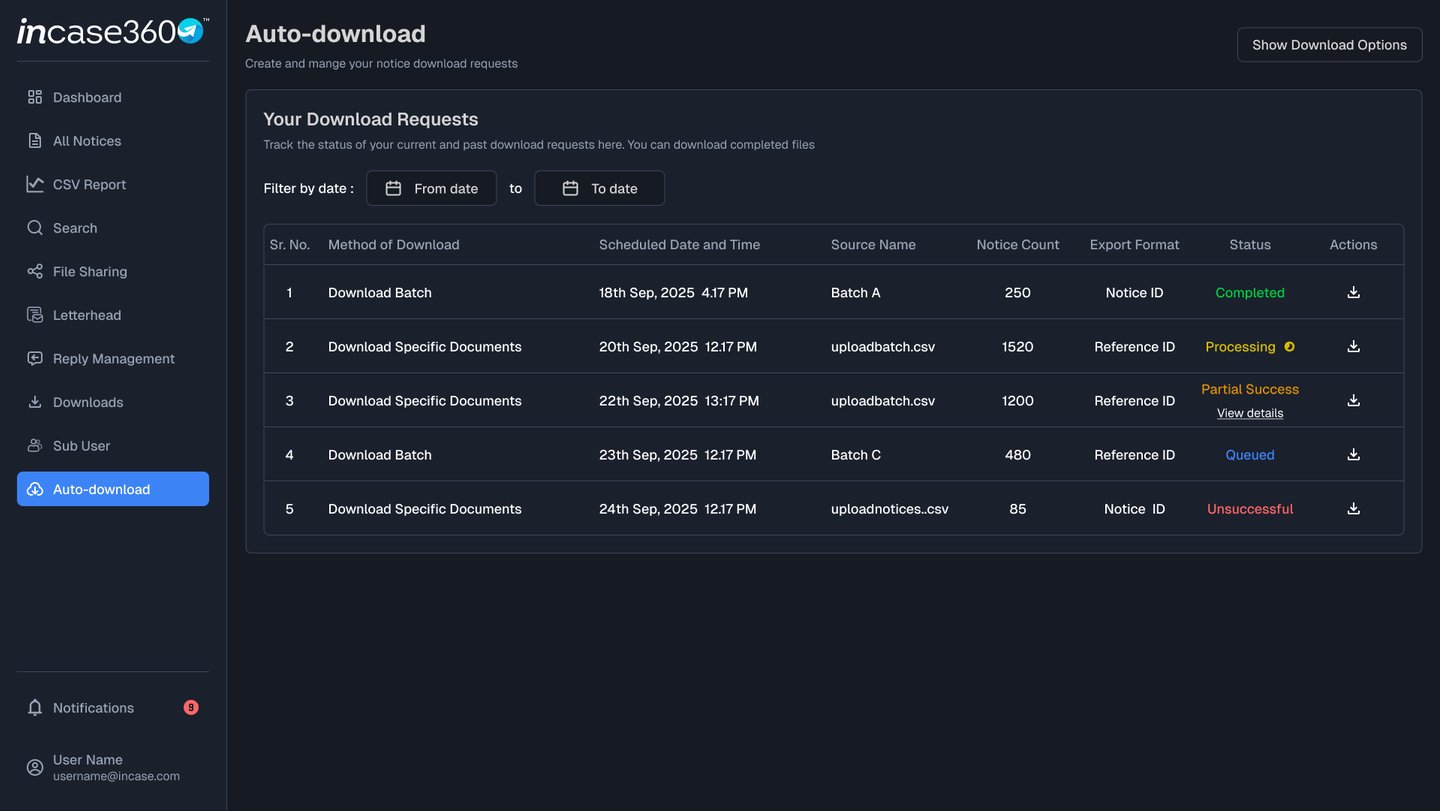
Download & Export Workflows Created Anxiety
The previous export experience lacked processing visibility, partial success handling, failure traceability, and actionable recovery states.
Users repeatedly re-submitted exports, contacted support, and manually reconciled missing IDs because they could not determine what failed, what completed, or what needed recovery.
Bulk Operations Lacked Workflow Confidence
Bulk upload workflows lacked upload transparency, validation confidence, and operational traceability.
Users feared failed uploads, incorrect mappings, missing records, and communication inconsistencies—creating repeated verification behavior.
Enterprise legal operations teams struggled to monitor, prioritize, and manage high-volume legal communication workflows because communication tracking, export visibility, reply monitoring, and operational statuses were fragmented across disconnected workflows, resulting in delayed actions, duplicate effort, operational uncertainty, and increased compliance risk.
CORE PROBLEM STATEMENT
60 Days After Launch, The Numbers Told an Incredible Story
I don't believe in vanity metrics. So I measured what actually mattered: operational throughput, business cost, and client trust. Here's what happened when we compared 60 days pre-launch vs. 60 days post-launch using ops logs, usage analytics, support tickets, and client surveys.
Metrics
Avg Case Action Time
SLA Breaches
Support Update Requests
Bulk Processing Throughput
Search-to-Action Speed
Client Renewal Confidence
14 min
27%
Baseline
Baseline
Baseline
Baseline
6 min
11%
Reduced
Improved
Improved
Improved
57% faster
59% reduction
43% decrease
68% faster
39% faster
+18 pts
Before
After
Improvements
What This Actually Means
We didn't just make the platform faster. We transformed how an entire business operates. Operations teams can now handle 2x the case volume with the same headcount. Enterprise clients renewed at higher rates. And the platform that was bleeding money? It became a competitive advantage.
Full UI Refresh Only
CHAPTER 2 : MY APPROACH
Building a mediation platform for the UK market required understanding both the technical legal requirements and the unique cultural expectations of British users.
How I Tackled the UK Market Challenge
UK Market Research
Interviewed 15 UK-based users, analyzed competitor platforms (Modria, Matterhorn), and studied GDPR compliance requirements for legal tech
Multi-Stakeholder Design
Designed for 3 distinct user groups: enterprise clients, individual disputants, and certified mediators across UK regions
Compliance-First UX
Designed for 3 distinct user groups: enterprise clients, individual disputants, and certified mediators across UK regions
👉 The challenge was legally complete but experientially incomplete for UK users
I used AI strategically to accelerate research, multiply iteration speed, and eliminate busywork—freeing me to focus on strategy and problem-solving.
Research & Analysis
Tasks:
Analytics data processing, interview transcription & coding, competitive analysis
Tools:
ChatGPT, Claude
Time Saved :
4 weeks → 1 week
Identified 62% search-first behavior, extracted themes from 26 interviews, analyzed 4 platforms
Design & Iteration
Tasks:
UX pattern exploration, microcopy writing, rapid prototyping
Tools:
ChatGPT, Midjourney, Claude, Figma AI
Time Saved :
4 weeks → 1 week
Explored 20+ layouts, wrote 40+ UI strings, generated A/B test variations
Validation & Documentation
Tasks:
Test scripts, feedback analysis, component documentation
Tools:
ChatGPT, Claude, Notion AI
Time Saved :
2.5 weeks → 4 days
Created 15 test scenarios, processed 18 beta tester feedback, documented handoff
10+ weeks
Time Saved
9
Tasks Accelerated
AI Tools Used
6
Strategic Control
100%
AI didn't make decisions or design solutions—I did. It just made me faster, sharper, and more thorough.
CHAPTER 2 : UNDERSTANDING THE GIANT
Before I Could Fix Anything, I Had to Understand What We Were Really Building
Presolv360 wasn't just another SaaS platform. It was India's leading Online Dispute Resolution (ODR) system—powering arbitration for banks, NBFCs, e-commerce companies, and major enterprises.
The platform had already resolved 1M+ disputes, impacted 2.5M+ people, and cut resolution costs by 65% compared to traditional litigation.
But here's the thing: success at scale creates new problems. What started as a functional admin tool couldn't keep up with enterprise demands. The interface that worked for 1,000 cases was breaking under 18,000. And as arbitration volume exploded, the cracks turned into canyons.
1M+
Disputes Resolved
2.5M+
People Impacted
100+
Enterprises Served
65%
Cost Reduction
CROSS - FUNCTIONAL TEAM
Cross-Functional Collaboration: 25+ People, 1 Vision
I led UX strategy and execution, collaborating with 25+ people across Product, Engineering, Sales, Operations, and Leadership to transform the platform.
Product & Strategy
Product Manager, Business Analyst, Data Analyst
Defined product vision, analyzed operational metrics, tracked usage patterns and post-launch impact
Leadership
CEO, VP of Product, VP of Engineering, Head of Customer Success
Set strategic direction, guided product strategy, allocated resources, validated client impact
Operations & Users (9)
Operations Manager, Admin Team (6), Legal Manager, Arbitrator
Provided workflow insights, beta tested daily, validated legal requirements and arbitrator workspace
Business & Sales
Sales Director, Customer Success Manager, Account Managers (4)
Shared client feedback, identified support tickets, tested beta features with enterprise users
Engineering (7)
Engineering Lead, Frontend Developers (3), Backend Developers (2), QA Engineer
Architected solutions, built React components, optimized bulk processing, validated workflows
Collaboration Across Milestones
Research
Analyzed 90 days of data with analysts, coordinated 26 user interviews
✓ 62% search-first behavior identified
Beta & Launch
Deployed to 4 clients, iterated with ops team, tracked metrics with analysts
✓ Fixed 12 issues, 57% faster actions
Design
Weekly reviews with PM/Engineering, validated with ops team
✓ Aligned on Command Center approach
Development
Daily standups with dev teams, QA collaboration, sales feedback loop
✓ 100+ screens in 24 sprint
25+
Team Members
12 Months
Timeline
5
Departments
24
Sprint Phases
CHAPTER 3 : THE INVESTIGATION
I Refused to Guess. Instead, I Became a Detective.
Too many designers jump straight to mockups. Not me. I needed evidence. Hard data. Real stories. So I launched a comprehensive research operation using four distinct sources—each revealing a different piece of the puzzle.
Product Analytics
62% of sessions started with search
41% users abandoned filters without applying
Bulk upload error rate: 18%
Case detail pages had highest time spent
Export reports used 3.4x weekly
The Insight :
💡 Users were not browsing—they were trying to locate and act quickly
90 days
User Interviews
26 Participants
8 Enterprise legal managers
6 Operations executives
5 Arbitrators
4 Internal admins
3 Leadership stakeholders
The Insight :
💡 The platform stored cases—but didn't manage work
Workflow Shadowing
Live observation
Dual-screen work using platform + spreadsheet
Manual status checking every morning
Slack follow-ups replacing system alerts
Bulk tasks broken into multiple manual steps
The Insight :
💡 Operations teams had built workarounds for platform gaps
Competitive Benchmarking
4 Platforms analyzed
CADRE ODR, Credgenics, SAMA, ADR ODR
Priority queues emphasized
Action-first dashboards
Saved filters standard
Bulk workflows critical
The Insight :
💡 Best products emphasized action over information
What The Users Actually Said (In Their Own Words)
"We still track urgent cases in Excel."
— Legal Manager
"I need to click too many screens before I can take action."
— Operations Executive
"Clients ask us for updates they should already see."
— Internal Admin
"I miss deadlines because reminders are buried."
— Arbitrator
These weren't complaints. They were cries for help. Every quote pointed to the same truth: the platform wasn't helping them work—it was getting in their way.
CHAPTER 5 : THE CROSSROADS
I Had Three Paths Forward. Two Would Fail. One Would Transform Everything.
With the problem clear, I needed a solution. But not just any solution—the right solution. I mapped out three strategic options, tested each against our research data, and made the hardest call of the project.
Full UI Refresh Only
The Idea:
Modernize colors, typography, spacing, tables
Why I Rejected It:
Improves perception but not throughput. Same broken workflows with better visuals.
💡 The Lesson: Aesthetic redesign without workflow redesign creates temporary satisfaction
❌ Rejected
Add More Automation Without UX Change
❌ Rejected
The Idea:
Auto reminders, auto assignments, auto escalations
Why I Rejected It:
Users already ignored existing notifications. More automation would increase noise.
💡 The Lesson: Bad UX + more automation = faster chaos
Workflow Command Center
The Idea:
Rebuild system around urgent actions first, role-based queues, unified case timeline, bulk operations, self-service reporting
Why I Chose It:
Directly solves throughput, visibility, and cost
💡 The Lesson: Transform from passive record management to active work management
✅ Selected
But Even the Right Path Had Failures
Choosing the Workflow Command Center approach was correct—but executing it wasn't perfect. I made mistakes. Here's what I learned:
Failed Attempt #1: Dashboard with 18 KPIs on top
What Happened: Users ignored most widgets
💡 Users came to work, not watch dashboards
Failed Attempt #2: All filters visible by default
What Happened: Overwhelming. Slower first interaction
💡 Power ≠ usability
These failures weren't setbacks—they were proof I was testing real solutions with real users. Each mistake taught me something that made the final product stronger.
CHAPTER 6 : THE STRATEGY
I Defined Four Principles That Would Guide Every Single Decision
Before touching Figma, before writing a single user story, I needed a North Star. Four principles that would keep the redesign focused, strategic, and bulletproof. These weren't just nice words—they became the foundation of every screen, every interaction, every choice.
Surface Decisions, Not Data
Users need to know what needs action now, what is delayed, what failed, and what impacts clients—not endless rows of data
Build for High-Frequency Operators
Ops teams spend hours in the system. Design must optimize scan speed, keyboard flow, repetitive actions, and batch handling
Turn Reporting Into Self-Service
Clients should not email support for updates. The platform should provide instant visibility
Build Trust Through Clarity
Legal products need calm, precise, professional UX that instills confidence
Every Great Decision Requires Sacrifice
Strategy isn't about what you include—it's about what you're willing to give up. Here are the four critical tradeoffs I made, and why each one was worth it:
Fewer Columns by Default
GAVE UP
Showing all data immediately
WHY ACCEPTABLE
82% users only needed 6 core fields
BENEFIT GAINED
Faster scanning + reduced cognitive load
Advanced Filters Hidden Behind Expand
GAVE UP
WHY ACCEPTABLE
BENEFIT GAINED
Instant access to 20+ filters
Analytics showed only 5 filters used regularly
Cleaner first interaction
Dashboard Summary Instead of Full Detail
GAVE UP
Everything on homepage
WHY ACCEPTABLE
Users wanted next action, not full history
BENEFIT GAINED
Decision speed improved
Standardized Workflows vs Client Customization
GAVE UP
Custom logic for every enterprise client
WHY ACCEPTABLE
Created maintenance debt
BENEFIT GAINED
Scalable product roadmap
CHAPTER 7 : THE EXECUTION
Now Came the Hard Part: Turning Strategy Into Reality
Research. Strategy. Principles. Tradeoffs. All of it meant nothing unless I could execute. Here's how I redesigned every major workflow in the platform—and why every decision was made with surgical precision.
Case Command Center
Why This Screen Exists :
Leadership needed instant portfolio visibility. The platform became proactive, not reactive.
The Transformation: Before → After
What Was Broken:
18% bulk upload error rate with no validation
Users re-uploaded entire sheets when few rows failed
No progress tracking - users didn't know if upload worked
Error messages were cryptic and unhelpful
No way to retry only failed rows
What I Built:
CSV bulk upload with validation
Error detection and correction
Batch processing status
Failed row retry mechanism
Real-time progress tracking
Every Decision Was Data-Driven
✓ Urgent cases ranked by SLA breach probability
Why: Ops users manually checked priority lists every morning
✓ Saved views added
Why: Enterprise users repeatedly filtered same segments
✓ Global search supports Case ID / Loan ID / Party Name
Why: 62% sessions began with search
AI AS A FORCE MULTIPLIER
How AI Saved 10+ Weeks While I Kept Strategic Control
I used AI strategically to accelerate research, multiply iteration speed, and eliminate busywork—freeing me to focus on strategy and problem-solving.
Research & Analysis
Tasks:
Analytics data processing, interview transcription & coding, competitive analysis
Tools:
ChatGPT, Claude
Time Saved :
4 weeks → 1 week
Identified 62% search-first behavior, extracted themes from 26 interviews, analyzed 4 platforms
Design & Iteration
Tasks:
UX pattern exploration, microcopy writing, rapid prototyping
Tools:
ChatGPT, Midjourney, Claude, Figma AI
Time Saved :
4 weeks → 1 week
Explored 20+ layouts, wrote 40+ UI strings, generated A/B test variations
Validation & Documentation
Tasks:
Test scripts, feedback analysis, component documentation
Tools:
ChatGPT, Claude, Notion AI
Time Saved :
2.5 weeks → 4 days
Created 15 test scenarios, processed 18 beta tester feedback, documented handoff
10+ weeks
Time Saved
9
Tasks Accelerated
AI Tools Used
6
Strategic Control
100%
AI didn't make decisions or design solutions—I did. It just made me faster, sharper, and more thorough.
CHAPTER 8 : THE TRANSFORMATION
60 Days After Launch, The Numbers Told an Incredible Story
I don't believe in vanity metrics. So I measured what actually mattered: operational throughput, business cost, and client trust. Here's what happened when we compared 60 days pre-launch vs. 60 days post-launch using ops logs, usage analytics, support tickets, and client surveys.
How I Measured Success
Compared pre-launch 60 days vs post-launch 60 days using ops logs, usage analytics, support tickets, and client surveys. No guessing. No assumptions. Just hard data.
Metrics
Avg Case Action Time
SLA Breaches
Support Update Requests
Bulk Processing Throughput
Search-to-Action Speed
Client Renewal Confidence
14 min
27%
Baseline
Baseline
Baseline
Baseline
6 min
11%
Reduced
Improved
Improved
Improved
57% faster
59% reduction
43% decrease
68% faster
39% faster
+18 pts
Before
After
Improvements
↓ 57%
Case Action Time
14 min → 6 min
↓ 43%
Support Requests
reduced dependency
↓ 59%
SLA Breaches
27% → 11%
↑ 68%
Bulk Throughput
processing speed
What This Actually Means
We didn't just make the platform faster. We transformed how an entire business operates. Operations teams can now handle 2x the case volume with the same headcount. Enterprise clients renewed at higher rates. And the platform that was bleeding money? It became a competitive advantage.
CHAPTER 9 : THE FUTURE