

UX / UI Case Study
How I Transformed a Failing Arbitration System Serving 18,000+ Cases Into an Operational Powerhouse
The story of how strategic UX redesign cut case action time by 57%, reduced SLA breaches by 59%, and saved an enterprise platform on the brink of losing client trust
Senior Product Designer
Legal Tech / Enterprise SaaS
Product Redesign
25+ Team Members
12 Month
CHAPTER 1 : THE CRISIS
When I Arrived, The Platform Was Bleeding Money and Losing Clients
It was Q2 of FY 2023. The arbitration platform I was brought in to fix was managing 18,000+ active cases across 100+ enterprise clients. On paper, it looked like a success story. In reality, it was a ticking time bomb.
Internal teams were missing SLAs on 27% of time-sensitive case actions. Enterprise clients were escalating concerns about poor visibility. Support tickets were flooding in. The operations team was drowning, spending 14 minutes per case on actions that should take under 5 minutes.
The worst part? Everyone knew the platform was the problem. But nobody knew exactly what was broken or how to fix it. That's where I came in.
18K+
Active Cases
100+
Enterprise Clients
27%
SLA Misses
14 min
Time per Case
The Stakes Were High
If we didn't fix this fast, Presolv360 would face declining renewals, increased servicing costs, and broken trust with clients who depended on us for speed and transparency. This wasn't just a design problem it was a business survival problem.
CHAPTER 2 : UNDERSTANDING THE GIANT
Before I Could Fix Anything, I Had to Understand What We Were Really Building
Presolv360 wasn't just another SaaS platform. It was India's leading Online Dispute Resolution (ODR) system powering arbitration for banks, NBFCs, e-commerce companies, and major enterprises.
The platform had already resolved 1M+ disputes, impacted 2.5M+ people, and cut resolution costs by 65% compared to traditional litigation.
But here's the thing: success at scale creates new problems. What started as a functional admin tool couldn't keep up with enterprise demands. The interface that worked for 1,000 cases was breaking under 18,000. And as arbitration volume exploded, the cracks turned into canyons.
1M+
Disputes Resolved
2.5M+
People Impacted
100+
Enterprises Served
65%
Cost Reduction
CROSS - FUNCTIONAL TEAM
Cross-Functional Collaboration: 25+ People, 1 Vision
I led UX strategy and execution, collaborating with 25+ people across Product, Engineering, Sales, Operations, and Leadership to transform the platform.
Product & Strategy
Product Manager, Business Analyst, Data Analyst
Defined product vision, analyzed operational metrics, tracked usage patterns and post-launch impact
Leadership
CEO, VP of Product, VP of Engineering, Head of Customer Success
Set strategic direction, guided product strategy, allocated resources, validated client impact
Operations & Users (9)
Operations Manager, Admin Team (6), Legal Manager, Arbitrator
Provided workflow insights, beta tested daily, validated legal requirements and arbitrator workspace
Business & Sales
Sales Director, Customer Success Manager, Account Managers (4)
Shared client feedback, identified support tickets, tested beta features with enterprise users
Engineering (7)
Engineering Lead, Frontend Developers (3), Backend Developers (2), QA Engineer
Architected solutions, built React components, optimized bulk processing, validated workflows
Collaboration Across Milestones
Research
Analyzed the data with analysts, coordinated 26 user interviews
✓ 62% search-first behavior identified
Beta & Launch
Deployed to 4 clients, iterated with ops team, tracked metrics with analysts
✓ Fixed 12 issues, 57% faster actions
Design
Weekly reviews with PM/Engineering, validated with ops team
✓ Aligned on Command Center approach
Development
Daily standups with dev teams, QA collaboration, sales feedback loop
✓ 100+ screens in 24 sprint
25+
Team Members
12 Months
Timeline
5
Departments
24
Sprint Phases
CHAPTER 3 : THE INVESTIGATION
I Refused to Guess. Instead, I Became a Detective.
Too many designers jump straight to mockups. Not me. I needed evidence. Hard data. Real stories. So I launched a comprehensive research operation using four distinct sources each revealing a different piece of the puzzle.
Product Analytics
62% of sessions started with search
41% users abandoned filters without applying
Bulk upload error rate: 18%
Case detail pages had highest time spent
Export reports used 3.4x weekly
The Insight :
💡 Users were not browsing—they were trying to locate and act quickly
90 days
User Interviews
26 Participants
8 Enterprise legal managers
6 Operations executives
5 Arbitrators
4 Internal admins
3 Leadership stakeholders
The Insight :
💡 The platform stored cases—but didn't manage work
Workflow Shadowing
Live observation
Dual-screen work using platform + spreadsheet
Manual status checking every morning
Slack follow-ups replacing system alerts
Bulk tasks broken into multiple manual steps
The Insight :
💡 Operations teams had built workarounds for platform gaps
Competitive Benchmarking
4 Platforms analyzed
CADRE ODR, Credgenics, SAMA, ADR ODR
Priority queues emphasized
Action-first dashboards
Saved filters standard
Bulk workflows critical
The Insight :
💡 Best products emphasized action over information
What The Users Actually Said (In Their Own Words)
"We still track urgent cases in Excel."
— Legal Manager
"I need to click too many screens before I can take action."
— Operations Executive
"Clients ask us for updates they should already see."
— Internal Admin
"I miss deadlines because reminders are buried."
— Arbitrator
These weren't complaints. They were cries for help. Every quote pointed to the same truth: the platform wasn't helping them work it was getting in their way.
CHAPTER 4 : THE REVELATION
Then It Hit Me: We Weren't Designing a Case Manager. We Were Designing a Work Manager.
After weeks of research, interviews, shadowing, and analysis, the pattern became crystal clear. The platform wasn't failing because it lacked features. It was failing because it was built around storing cases instead of managing work.
Here's the core problem I discovered :
Enterprise legal teams and internal operations staff were unable to quickly identify and complete high-priority arbitration actions because:
Case data was fragmented across tables
Alerts lacked visibility
Workflows required multiple manual steps
The result? Delayed closures, SLA breaches, and higher servicing costs per case.
USER TYPE
Enterprise legal teams + ops staff
BUSINESS IMPACT
Delayed closures, SLA breaches, higher costs
FAILED ACTIONS
Identify + complete priority actions
ROOT CAUSE
Fragmented data + weak alerts + manual workflows
CHAPTER 5 : THE CROSSROADS
I Had Three Paths Forward. Two Would Fail. One Would Transform Everything.
With the problem clear, I needed a solution. But not just any solution the right solution. I mapped out three strategic options, tested each against our research data, and made the hardest call of the project.
Full UI Refresh Only
The Idea:
Modernize colors, typography, spacing, tables
Why I Rejected It:
Improves perception but not throughput. Same broken workflows with better visuals.
💡 The Lesson: Aesthetic redesign without workflow redesign creates temporary satisfaction
❌ Rejected
Add More Automation Without UX Change
❌ Rejected
The Idea:
Auto reminders, auto assignments, auto escalations
Why I Rejected It:
Users already ignored existing notifications. More automation would increase noise.
💡 The Lesson: Bad UX + more automation = faster chaos
Workflow Command Center
The Idea:
Rebuild system around urgent actions first, role-based queues, unified case timeline, bulk operations, self-service reporting
Why I Chose It:
Directly solves throughput, visibility, and cost
💡 The Lesson: Transform from passive record management to active work management
✅ Selected
But Even the Right Path Had Failures
Choosing the Workflow Command Center approach was correct but executing it wasn't perfect. I made mistakes. Here's what I learned:
Failed Attempt #1: Dashboard with 18 KPIs on top
What Happened: Users ignored most widgets
💡 Users came to work, not watch dashboards
Failed Attempt #2: All filters visible by default
What Happened: Overwhelming. Slower first interaction
💡 Power ≠ usability
These failures weren't setbacks they were proof I was testing real solutions with real users. Each mistake taught me something that made the final product stronger.
CHAPTER 6 : THE STRATEGY
I Defined Four Principles That Would Guide Every Single Decision
Before touching Figma, before writing a single user story, I needed a North Star. Four principles that would keep the redesign focused, strategic, and bulletproof. These weren't just nice words they became the foundation of every screen, every interaction, every choice.
Surface Decisions, Not Data
Users need to know what needs action now, what is delayed, what failed, and what impacts clients—not endless rows of data
Build for High-Frequency Operators
Ops teams spend hours in the system. Design must optimize scan speed, keyboard flow, repetitive actions, and batch handling
Turn Reporting Into Self-Service
Clients should not email support for updates. The platform should provide instant visibility
Build Trust Through Clarity
Legal products need calm, precise, professional UX that instills confidence
Every Great Decision Requires Sacrifice
Strategy isn't about what you include it's about what you're willing to give up. Here are the four critical tradeoffs I made, and why each one was worth it:
Fewer Columns by Default
GAVE UP
Showing all data immediately
WHY ACCEPTABLE
82% users only needed 6 core fields
BENEFIT GAINED
Faster scanning + reduced cognitive load
Advanced Filters Hidden Behind Expand
GAVE UP
WHY ACCEPTABLE
BENEFIT GAINED
Instant access to 20+ filters
Analytics showed only 5 filters used regularly
Cleaner first interaction
Dashboard Summary Instead of Full Detail
GAVE UP
Everything on homepage
WHY ACCEPTABLE
Users wanted next action, not full history
BENEFIT GAINED
Decision speed improved
Standardized Workflows vs Client Customization
GAVE UP
Custom logic for every enterprise client
WHY ACCEPTABLE
Created maintenance debt
BENEFIT GAINED
Scalable product roadmap
CHAPTER 7 : THE EXECUTION
Now Came the Hard Part: Turning Strategy Into Reality
Research. Strategy. Principles. Tradeoffs. All of it meant nothing unless I could execute. Here's how I redesigned every major workflow in the platform and why every decision was made with surgical precision.
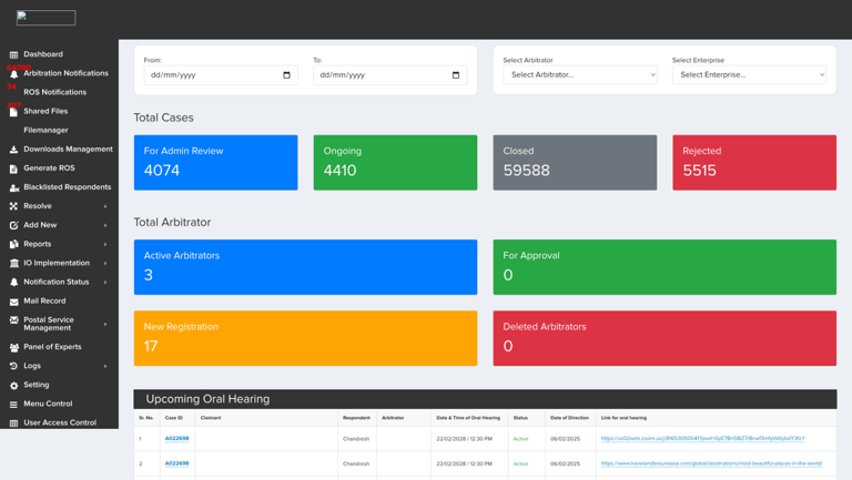
Arbitration Dashboard
Why This Screen Exists :
Leadership needed instant portfolio visibility. The platform became proactive, not reactive.
The Transformation: Before → After
What Was Broken:
Lack of clear visual hierarchy made important information hard to identify.
Excessive colors and dense layouts created visual clutter.
Poor information grouping increased cognitive load.
Raw metrics lacked actionable insights and analytics.
Overcrowded navigation reduced usability and discoverability.
What I Built:
Clear hierarchy improved dashboard readability and focus.
Cleaner UI reduced visual noise and enhanced usability.
Structured layouts improved information scanning and flow.
Data visualizations enabled faster analytical decision-making.
Simplified navigation and filters improved workflow efficiency.

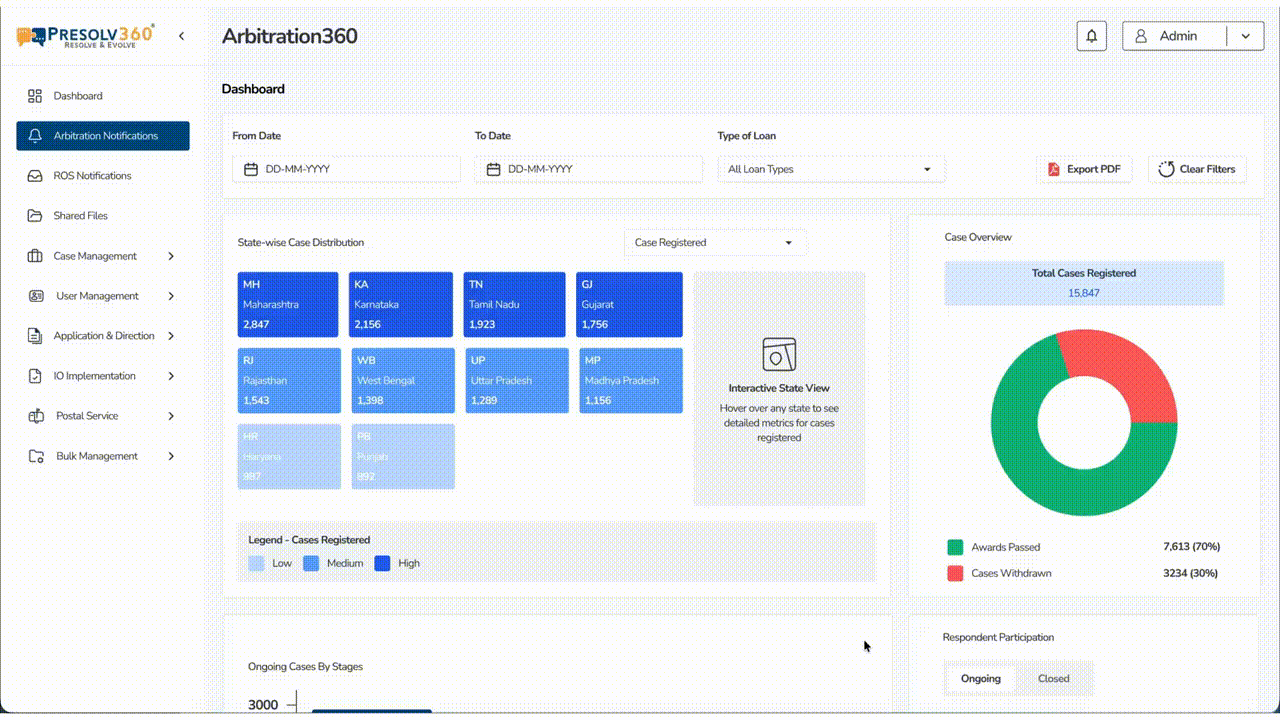
Every Decision Was Data-Driven
✓ Shifted to an Analytical Dashboard
Why: Focused on insights and decision-making instead of only displaying counts.
✓ Reduced Color Dependency
Why: Used colors strategically for status and data emphasis to reduce visual fatigue.
✓ Grouped Information by Workflow
Why: Organized data into logical sections to improve usability and task efficiency.
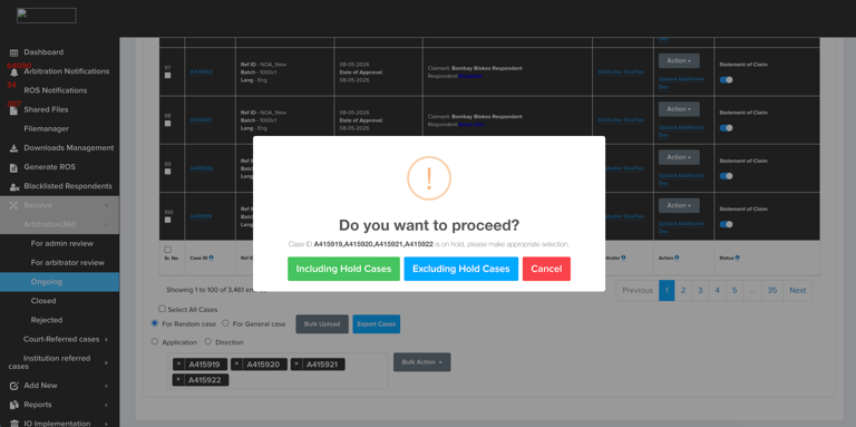
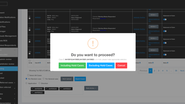
Bulk Action Console
Why This Screen Exists :
Operations teams handled hundreds of repetitive actions daily. Bulk workflows needed to be bulletproof.
The Transformation: Before → After
What Was Broken:
18% bulk upload error rate with no validation
Users re-uploaded entire sheets when few rows failed
No progress tracking - users didn't know if upload worked
Error messages were cryptic and unhelpful
No way to retry only failed rows
What I Built:
Enabled CSV bulk uploads with automated validation checks.
Built smart error detection and quick correction workflows.
Added batch processing status for real-time operation monitoring.
Introduced failed row retry mechanism to reduce manual rework.
Implemented live progress tracking for better upload visibility.
Every Decision Was Data-Driven
✓ Upload validation added
Why: 18% files failed formatting
✓ Retry failed rows added
Why: Users re-uploaded entire sheets
✓ Progress tracker added
Why: To reduce support queries
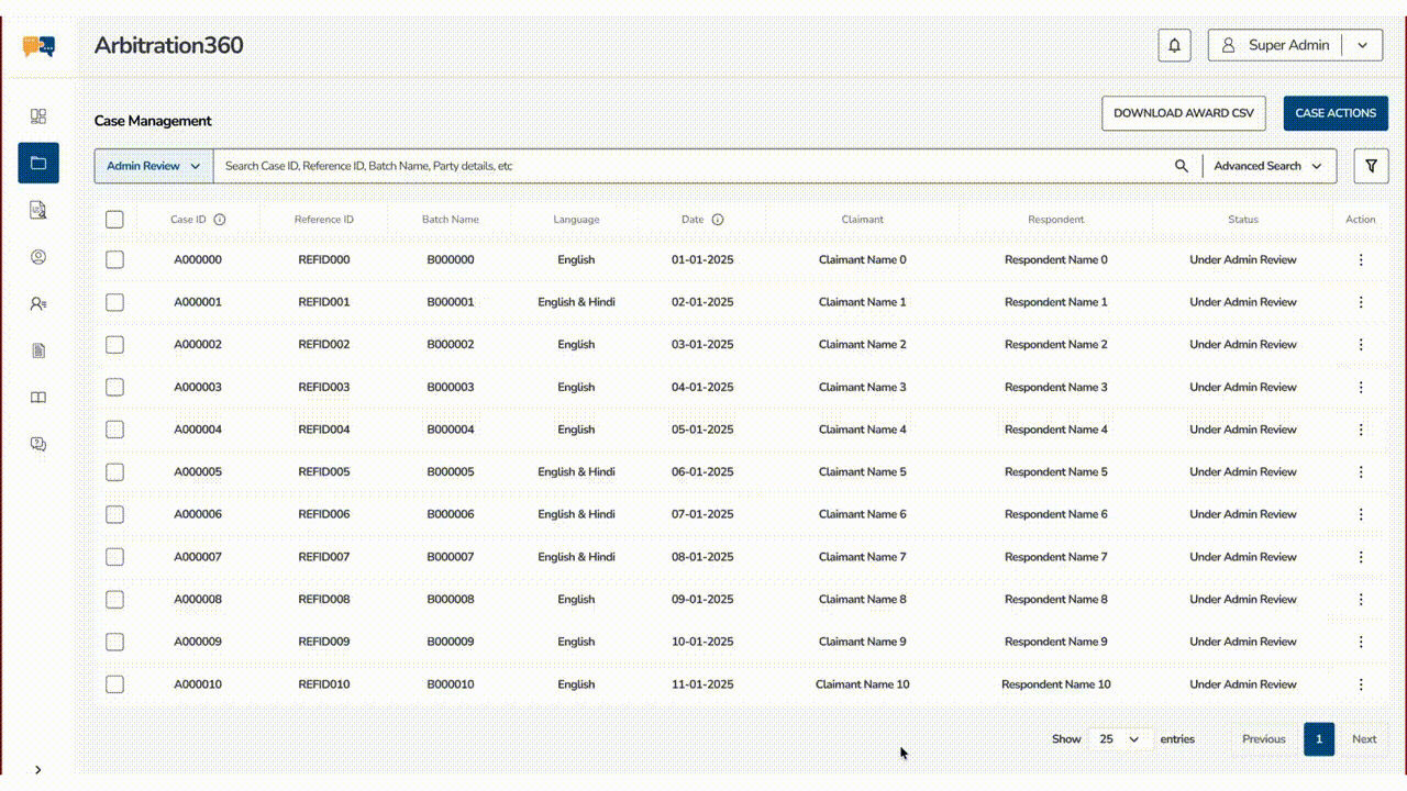
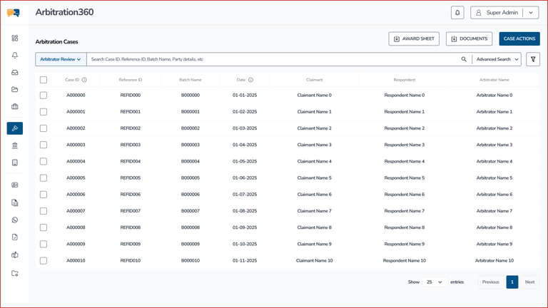
Arbitrator Review
Why This Screen Exists :
This screen helps admins efficiently review, manage, and take actions on arbitration cases from a centralized system.
The Transformation: Before → After
What Was Broken:
Heavy sidebar navigation created visual clutter and reduced focus on data.
Dense table layout made case scanning and readability difficult.
Filters and search lacked hierarchy and felt disconnected from workflows.
Excessive borders, colors, and spacing inconsistencies reduced UI clarity.
The interface felt outdated and operational instead of modern and task-focused.
What I Built:
Minimal sidebar improved focus on primary case management tasks.
Cleaner table structure enhanced readability and quick data scanning.
Unified search and advanced filters streamlined case discovery workflows.
Consistent spacing and typography created a modern enterprise experience.
Clear action buttons improved accessibility to key operational tasks.

Every Decision Was Data-Driven
✓ Simplified Navigation Structure
Why : Reduced sidebar complexity to prioritize core workflows and improve focus.
✓ Introduced a Minimal Data Table UI
Why: Used whitespace, alignment, and cleaner rows to improve scanability.
✓ Centralized Search & Actions
Why: Merged search, filters, and actions into one workflow area for faster task execution.
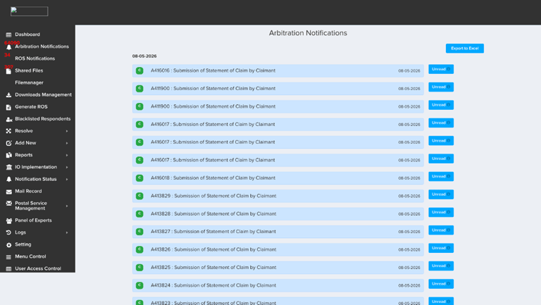
Arbitrator Notifications
Why This Screen Exists :
Users track, manage, and prioritize arbitration-related notifications from a centralized communication system.
The Transformation: Before → After
What Was Broken:
Notification cards felt repetitive and visually cluttered.
Lack of hierarchy made unread and important notifications hard to identify.
Excessive sidebar complexity distracted users from primary tasks.
No bulk actions or filtering reduced notification management efficiency.
The interface lacked structure, making scanning and tracking difficult.
What I Built:
Structured notification grouping improved readability and organization.
Read and unread sections created better priority visibility.
Added bulk actions for faster notification management workflows.
Search and filters improved discoverability and tracking efficiency.
Cleaner UI and spacing created a modern enterprise experience.

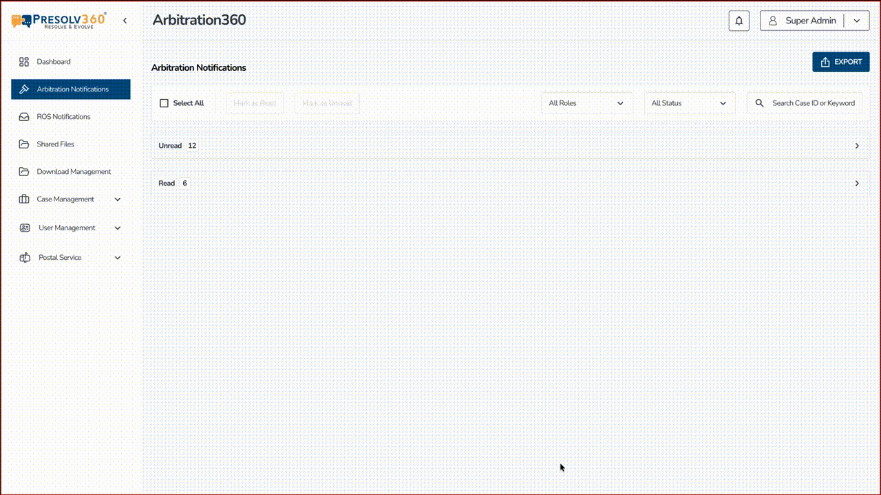
Every Decision Was Data-Driven
✓ Introduced Notification Categorization
Why : Grouped notifications into read/unread sections for faster prioritization.
✓ Added Bulk Management Controls
Why: Enabled actions like mark as read/unread to improve operational efficiency.
✓ Simplified the Visual System
Why: Reduced clutter using whitespace, lighter layouts, and minimal components for better focus.
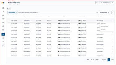
User Management
Why This Screen Exists :
Reduce dependency on support teams. Enable client self-service for 90% of common queries.
The Transformation: Before → After
What Was Broken:
The form-heavy layout created unnecessary visual and cognitive overload.
Multiple tabs, tables, and actions lacked clear workflow hierarchy.
Dense navigation and inconsistent spacing reduced usability.
Important user actions were scattered and difficult to access quickly.
The interface felt outdated and inefficient for large-scale user management.
What I Built:
Simplified table-first layout improved focus on user management tasks.
Cleaner spacing and typography enhanced readability and scanability.
Centralized search and filters streamlined user discovery workflows.
Contextual action menus reduced clutter while improving accessibility.
Minimal navigation created a more modern and enterprise-ready experience.

Every Decision Was Data-Driven
✓ Shifted From Form-Centric to Data-Centric Design
Why : Prioritized user monitoring and management over manual data entry workflows.
✓ Introduced Contextual Action Menus
Why: Moved secondary actions into dropdowns to reduce visual clutter.
✓ Simplified Information Architecture
Why: Reduced navigation complexity and grouped workflows for faster task execution.
AI AS A FORCE MULTIPLIER
How AI Saved 10+ Weeks While I Kept Strategic Control
I used AI strategically to accelerate research, multiply iteration speed, and eliminate busywork freeing me to focus on strategy and problem-solving.
Research & Analysis
Tasks:
Analytics data processing, interview transcription & coding, competitive analysis
Tools:
ChatGPT, Claude
Time Saved :
4 weeks → 1 week
Identified 62% search-first behavior, extracted themes from 26 interviews, analyzed 4 platforms
Design & Iteration
Tasks:
UX pattern exploration, microcopy writing, rapid prototyping
Tools:
ChatGPT, Midjourney, Claude, Figma AI
Time Saved :
4 weeks → 1 week
Explored 20+ layouts, wrote 40+ UI strings, generated A/B test variations
Validation & Documentation
Tasks:
Test scripts, feedback analysis, component documentation
Tools:
ChatGPT, Claude, Notion AI
Time Saved :
2.5 weeks → 4 days
Created 15 test scenarios, processed 18 beta tester feedback, documented handoff
10+ weeks
Time Saved
9
Tasks Accelerated
AI Tools Used
6
Strategic Control
100%
AI didn't make decisions or design solutions—I did. It just made me faster, sharper, and more thorough.
CHAPTER 8 : THE TRANSFORMATION
60 Days After Launch, The Numbers Told an Incredible Story
I don't believe in vanity metrics. So I measured what actually mattered: operational throughput, business cost, and client trust. Here's what happened when we compared 60 days pre-launch vs. 60 days post-launch using ops logs, usage analytics, support tickets, and client surveys.
How I Measured Success
Compared pre-launch 60 days vs post-launch 60 days using ops logs, usage analytics, support tickets, and client surveys. No guessing. No assumptions. Just hard data.
Metrics
Avg Case Action Time
SLA Breaches
Support Update Requests
Bulk Processing Throughput
Search-to-Action Speed
Client Renewal Confidence
14 min
27%
Baseline
Baseline
Baseline
Baseline
6 min
11%
Reduced
Improved
Improved
Improved
57% faster
59% reduction
43% decrease
68% faster
39% faster
+18 pts
Before
After
Improvements
↓ 57%
Case Action Time
14 min → 6 min
↓ 43%
Support Requests
reduced dependency
↓ 59%
SLA Breaches
27% → 11%
↑ 68%
Bulk Throughput
processing speed
What This Actually Means
We didn't just make the platform faster. We transformed how an entire business operates. Operations teams can now handle 2x the case volume with the same headcount. Enterprise clients renewed at higher rates. And the platform that was bleeding money? It became a competitive advantage.
CHAPTER 9 : THE FUTURE
But I'm Not Done. The Data Shows What to Build Next.
Great designers don't just solve today's problems they spot tomorrow's opportunities. After analyzing post-launch data, I discovered that 34% of delayed cases involved low respondent participation. That insight unlocked the next phase.
Predict non-participation risk at filing stage
Why: 34% delayed cases involved low respondent participation
Recommend optimal communication channels
Why: Data showed channel effectiveness varies by case type
AI-generated next best actions
Why: Reduce decision fatigue for high-volume operators
Delay forecasting model for legal heads
Why: Enable proactive intervention before SLA breaches
Mobile ops quick-action panel
Why: Enable on-the-go case management
This Wasn't a Redesign
It was aligning product operations with business growth.
Fast
The website sells trust. The platform must deliver it.
Efficient
Enforceable
Scalable
Trusted
If you're looking for someone who combines research rigor, strategic thinking, and measurable business impact—someone who doesn't just make things pretty, but makes businesses stronger—let's talk.
I leverage modern AI tools strategically to work faster and smarter, but I never outsource the thinking. Every decision, every strategy, every solution came from human insight AI just helped me execute at superhuman speed.
And I know how to lead cross-functional teams. This project brought together 25+ people across Product, Engineering, Sales, Operations, and Leadership. I coordinated research with analysts, aligned strategy with product managers, collaborated daily with developers, validated workflows with ops teams, and presented impact to executives. Great design is a team sport and I know how to be the captain.
This is where the comprehensive
version ends.
The thinking, trade-offs, and iterations continue beyond this page.
Happy to discuss them one-on-one on call.
